
(Well, it is not yet a package, but trust me: I’ll make sure it gets one.)
As a programmer or console user you might know the pain of having not as much characters on you screen as you would like to. You tried around with different fonts, it got better by reducing font size but it is not yet perfect. If I tell you, that you just have the wrong fonts you probably moan „… I tried all installed fonts“. And you are right by that: The fonts I am going to tell you about are definitely not preinstalled.
I ran into the font trouble a couple of years ago. As my eyes are quite good I yearned for a really tiny font to overflow my brain with as much content as possible on the same time. After I a while I started a research on the web and found a page that already sounds like a perfect hit: proggyfonts.com. The site hosts 24 monospaced bitmap programming fonts (licensed under a free BSD-type personal license) enhanced for a small screen footprint and issues that programmers often run into like differing 0 (zero) from O (capital letter „o“).
Font comparison
The font I use is called „ProggyFont Tiny Slashed Zero“ which stands for: A real tiny font with a cleary slashed zero. To compare it to a „normal“ font let’s see it in action. Here you can see a default installed Monospace font which has been set up to a small font size:
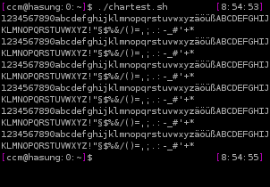
Concentrate on the characters you see above: They blur a bit. It’s not a big deal but if you are working with it for hours it gets one. Now let’s compare the same screen with ProggyFont Tiny Slashed Zero:
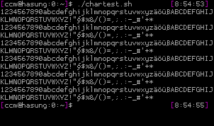
See how clear the characters are? It even got smaller – you could handle one or two lines more within the same space if you would resize the window according to the previous one. What a relief!
Even more fonts
Now the example given is the most aggressive one as it is really small. You might consider other fonts as helpfull. Let me give you another example of a font: Proggy Clean (better to read as it is bigger) Slashed Zero Bold Punc – see yourself:
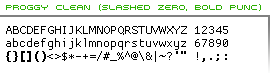
What have they done? They assume when you are a programmer you like characters like brackets, colons and so on being bold as the mean something in the code. Often you have to deal with interfaces that don’t mark those characters. Now the font does this for you. Nice, isn’t it? Now even cat and less show you bold coding elements without even configuring them to do so.
Installation
The site hosts the fonts in different formats. As I am lazy and is supported I only use the TTF font. To enroll a font in Gnome you have two ways depending on your Gnome version. First download a font package, unzip it, so you have file named fontname.ttf. To speak in Ubuntu versions: If you running Ubuntu Gutsy or below, open Nautilus, go to „fonts:///“ and drag and drop the ttf file into it and just restart your X session. If you have Hardy, create a directory called „.fonts“ in your home directory and copy the ttf file into it. Restart X afterwards (though not all applications depend on this).
Now open the application you want to enhace with your shiny new font. Let’s say it’s gnome-terminal. You should be able to choose a font named ProggySomething. Now you have to choose a font size and that is the only tricky thing to do: You have to find out the only possible font size. This setting might differ from application to application. In gnome-termin it is „11“ for instance which seems huge, but in fact is not. Just try it out. Under KDE or even Windows/OSX you’ll find out fast how to enroll the fonts. In fact it works, you just have to try.
So now you have a new set of fonts ready to boost your productivity. Make sure you don’t get a headache when using it and don’t crash your brain with an information overflow. I’ll report back when I packaged those fonts for a simple usage in Debian/Ubuntu.
Have you tried Terminus?
Terminus looks better in console, imho.
Please upload them to Debian so that all Debian-based distributions can benefit from them instead of just Ubuntu!
Hi,
I’ve been using Courier New for years now. I know it’s not free, but I’ve never found a better monospace font.
@John/Vyazovoi: Surely a question of taste. Terminus is fine, but for me it consumes too much space vertically. Proggy Tiny saves some pixels and therefore provides you with more lines on the same space.
@foo: Let me package it first, but you are right of course, that at the end of the day the package should go to Debian.
@Evil: Uh well, again a questions of taste. Actually I think one should use what suites best. Though using a non free font is a pity of course.
hi, i have followed your instructions and the font shows up in gnome terminal, but not in xlsfonts, (i put the ttf font in ~/.fonts) but how do i call it from the command line like: rxvt-unicode -fn ‚…..‘? or how do i specify this font in my .Xresources?
Thanks for the article!
@peter: I am pleased, you like the fonts. There is a small howto explaining how to set up TTF fonts in X applications. See
http://wiki.netbsd.se/How_to_use_TTF_fonts_in_xterm
Does this help?
Pingback: Proggy_fonts, fuentes de texto para programadores « Ubuntu Life
Caspar, you’re welcome to join the Debian fonts team (http://pkg-fonts.alioth.debian.org/) to get this open font in
ccm:
I discovered that the fonts need to be called with xft first, then it works from .Xresources or the command line.
urxvt -fn ‚xft:ProggyCleanTTSZ:style=Regular‘